Using the Page Editor
🏗️ Site Builder Overview
The same functionality and hierarchy of elements exist in both the Funnel and Site Builder. Let's hop in and check out our Site Builder and how you use it to create sites.
🔍 Site Builder Navigation Bar
The site builder navigation bar lives at the top of the builder and allows you to toggle between all of the various features. We will review each of these tabs below.
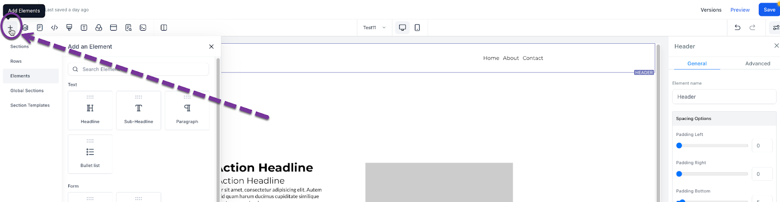
➕ Adding a New Element
Rows and columns are the building blocks of your site and are used to house elements. To add an element, like an image, you need at least one section, one row, and one column. Then you will be prompted to add an element. There are many elements, each element is unique.
Now let’s add an element to your site. In the top right of your site editor, you can select "Add Element" to see your options for what objects can be added to your site. Once you have chosen the element you would like to add, click and drag the element to the area you prefer.
🧱 Understanding Element Nesting
Every element on a webpage requires a section. Within this section, you need to have at least one row. This row needs to have at least one column. Adding all three of these (Section > Column > Row) we are then able to add an element from the "+Add Element" bar.
From largest to smallest, we have:
Sections (Green) > Rows (Blue) > Columns (Pink) > Elements (Orange)
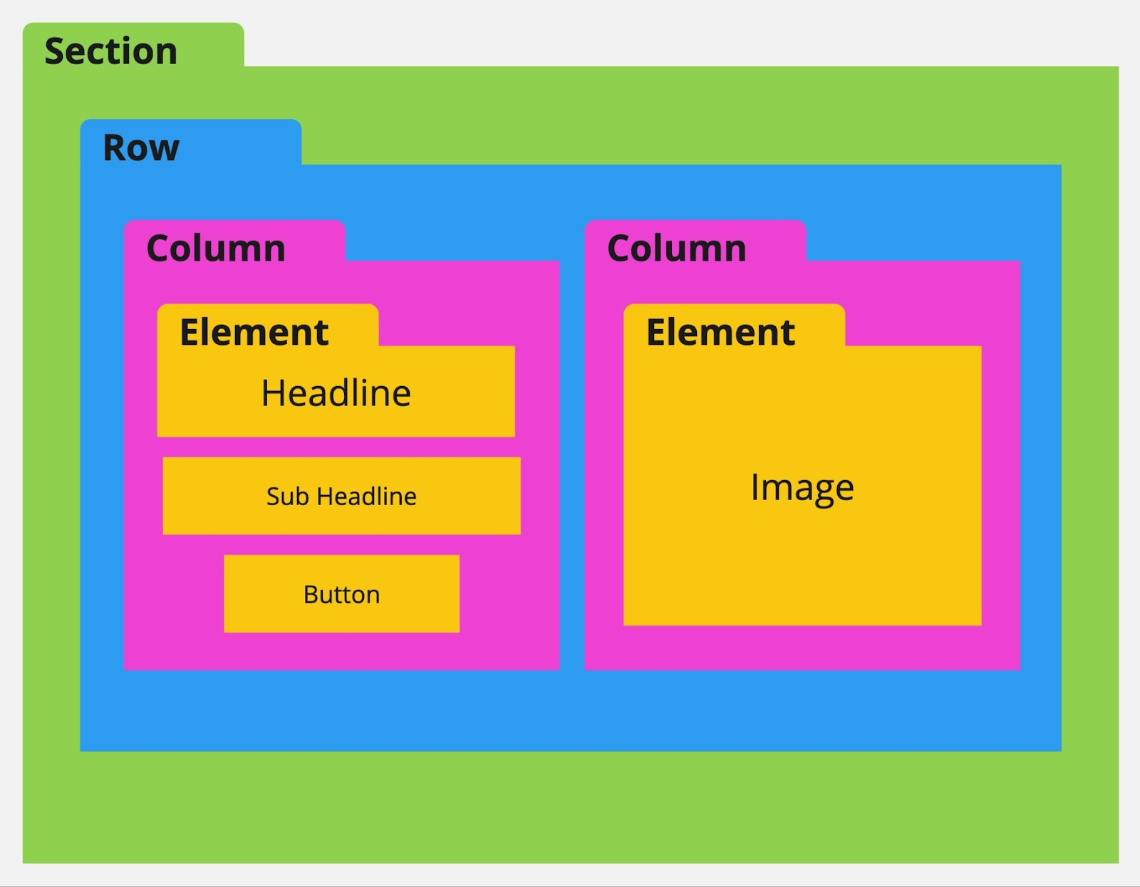
🚫 About Sections, Rows, and Columns...
- You cannot add a section within a section.
- Nor can you add a row within a row or a column within a column.
- You also cannot add an element within an element.
- ✅ You can add multiple rows into a section.
- ✅ Within a row, you can add multiple columns.
- ✅ Within a column, you can add multiple elements.
- ✅ You must have at least one section, one row, and one column to add an element.
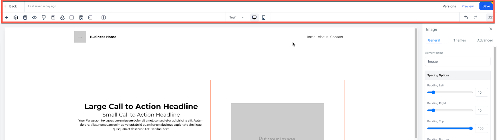
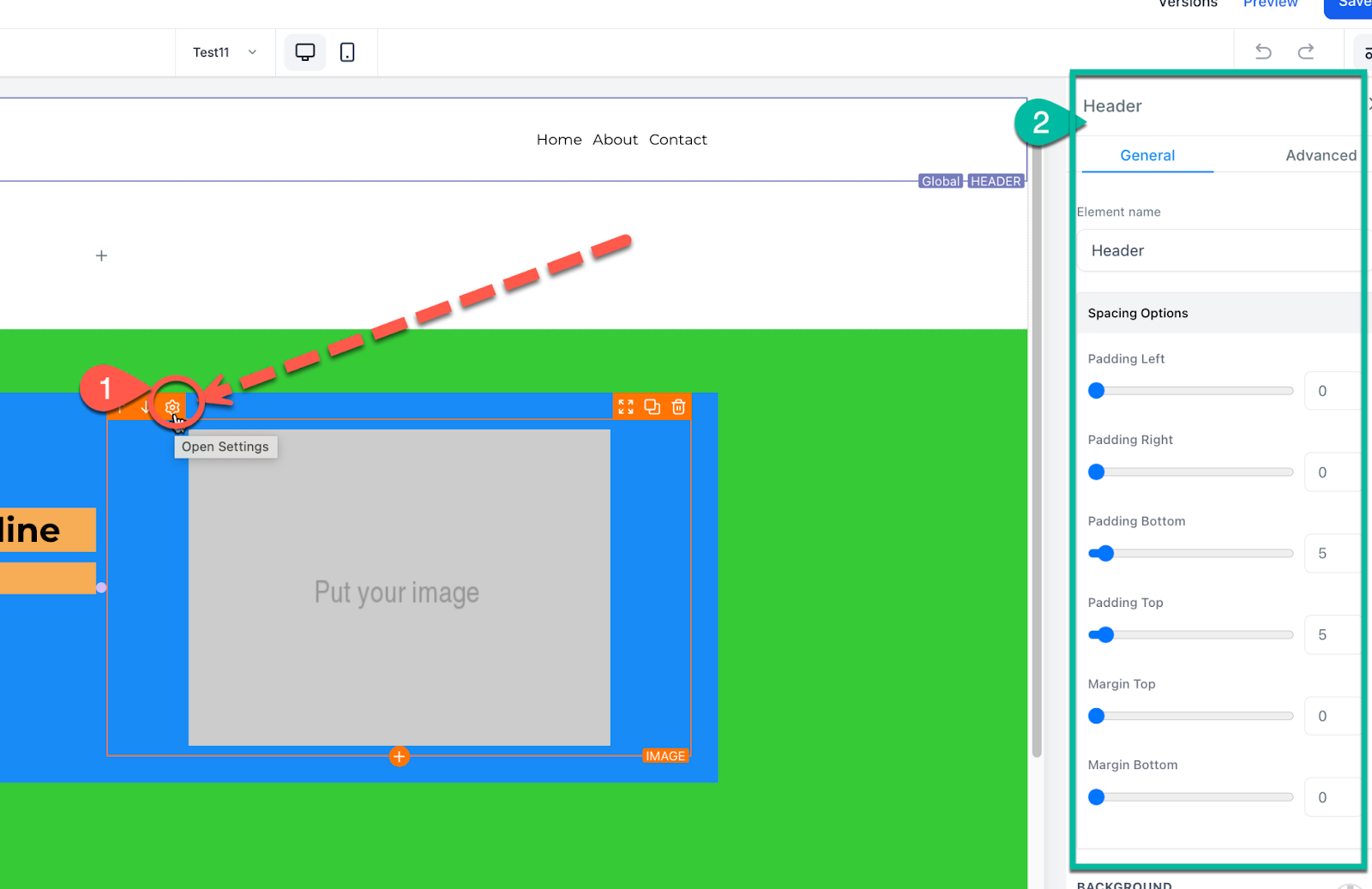
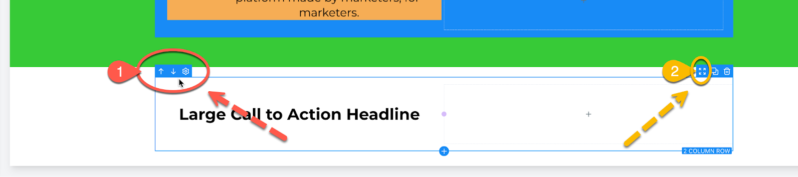
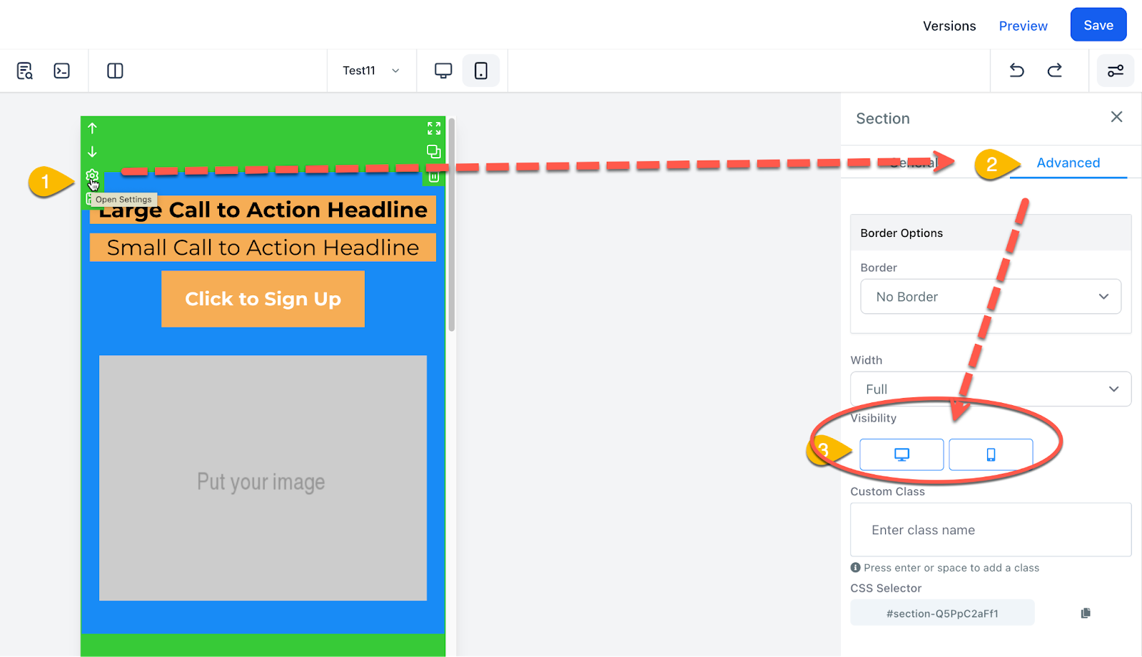
⚙️ Element Settings
To edit a specific section, row, column, or element, hover over the element then click on the gear setting icon that appears. Clicking on any part of the element will also automatically open the pop-out settings menu on the right.
Within these settings, you can add padding, margin, change visibility, and much more. Also, note the "General" and "Advanced" Tabs which offer more settings you can use to make your site great.
📏 Padding and Margin
When you want to move or put space between an element on your webpage — you are going to be adjusting the Padding or Margin. This is done within the object settings.
- Padding: Adds space within a section, row, column, or element. Padding moves inward.
- Margin: Adds distance outside of a section, row, column, or element. Margin moves outward, separating objects.
🔄 Moving an Element
You can move an object by using the up or down arrows seen when hovering over the object. This will shift the element up or down based on the elements around it. In addition, you can move an object by hovering over the object, and then clicking and holding the move icon. This will let you move the object. Release the held click to drop it into its new place.
Option 1: Up/Down Arrows – move the object up or down. Option 2: Click and Drag – click, hold, and drag to the desired location, then release.
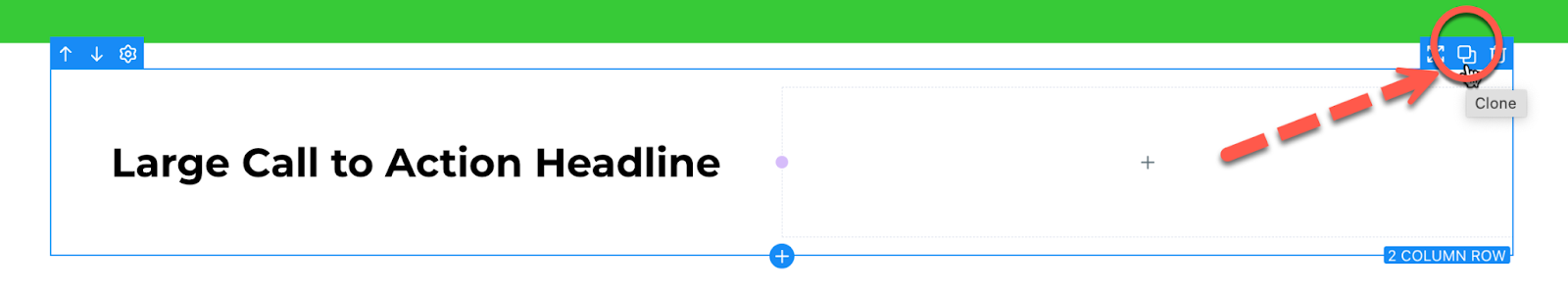
🧬 Cloning an Element
Hover over any object to reveal the clone option. This duplicates the object and all settings/contents within it — great for reusing layouts or elements.
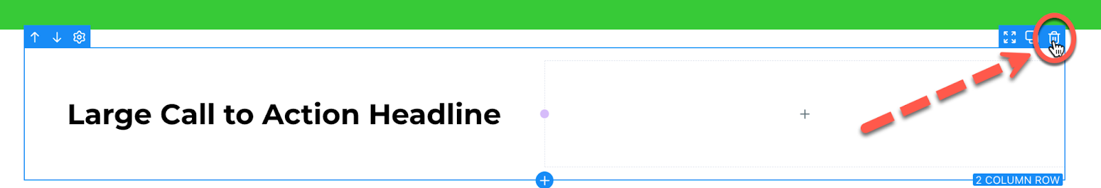
🗑️ Deleting an Element
To delete/remove an object:
- Hover over it.
- Click the trash can icon.
- Undo/Redo if you need to recover it.
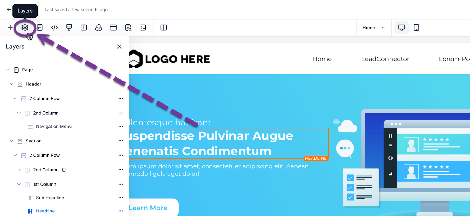
🧩 Layers
Layers help you visualize and manage all objects and their nesting inside the site structure. Especially useful if an object is hidden from mobile or desktop view.
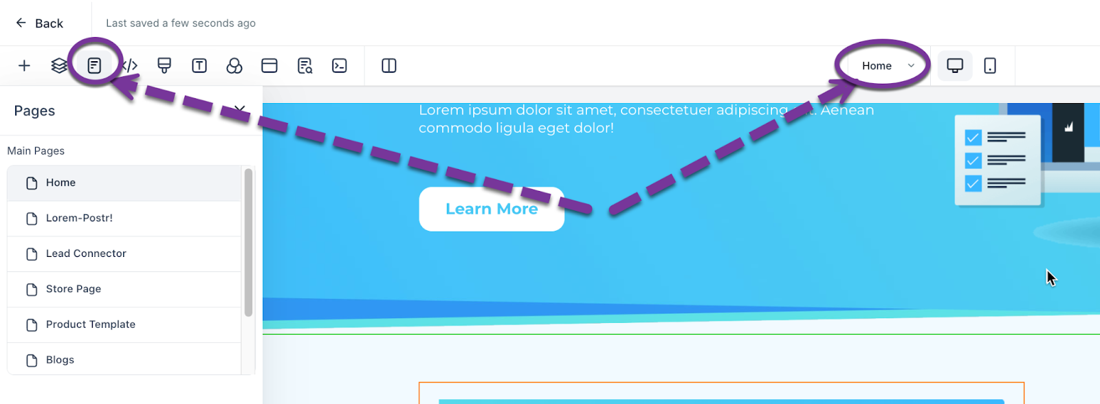
📄 Pages
Use the Pages Tab to switch between web pages inside your Funnel or Website. Accessible from the middle or right navigation bar.
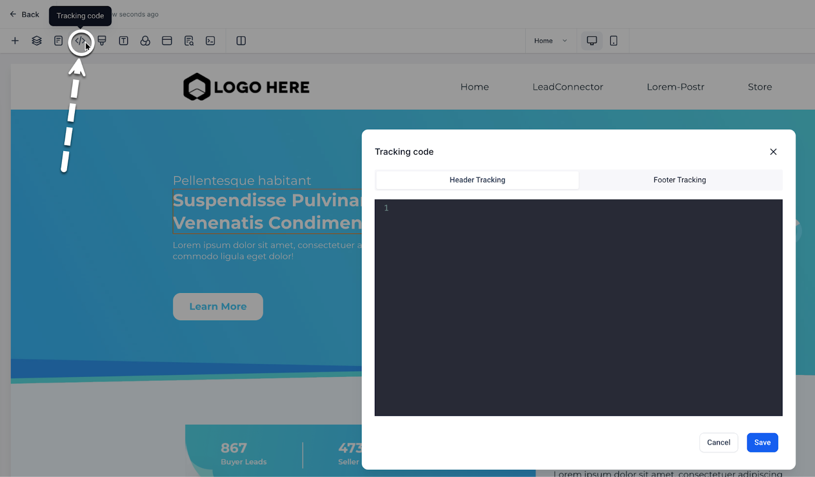
📊 Tracking Code
Need to add a tracking code to the header or footer? Add it from the Tracking Code page.
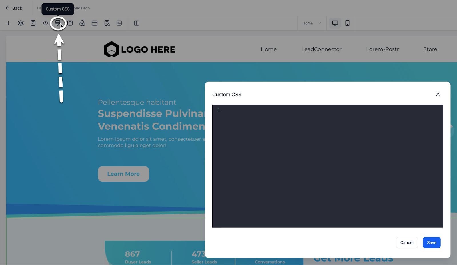
🎨 Custom CSS
Want to use custom CSS? Add it from the Custom CSS Tab.
💡 Ask a developer to write and implement code for your specific needs.
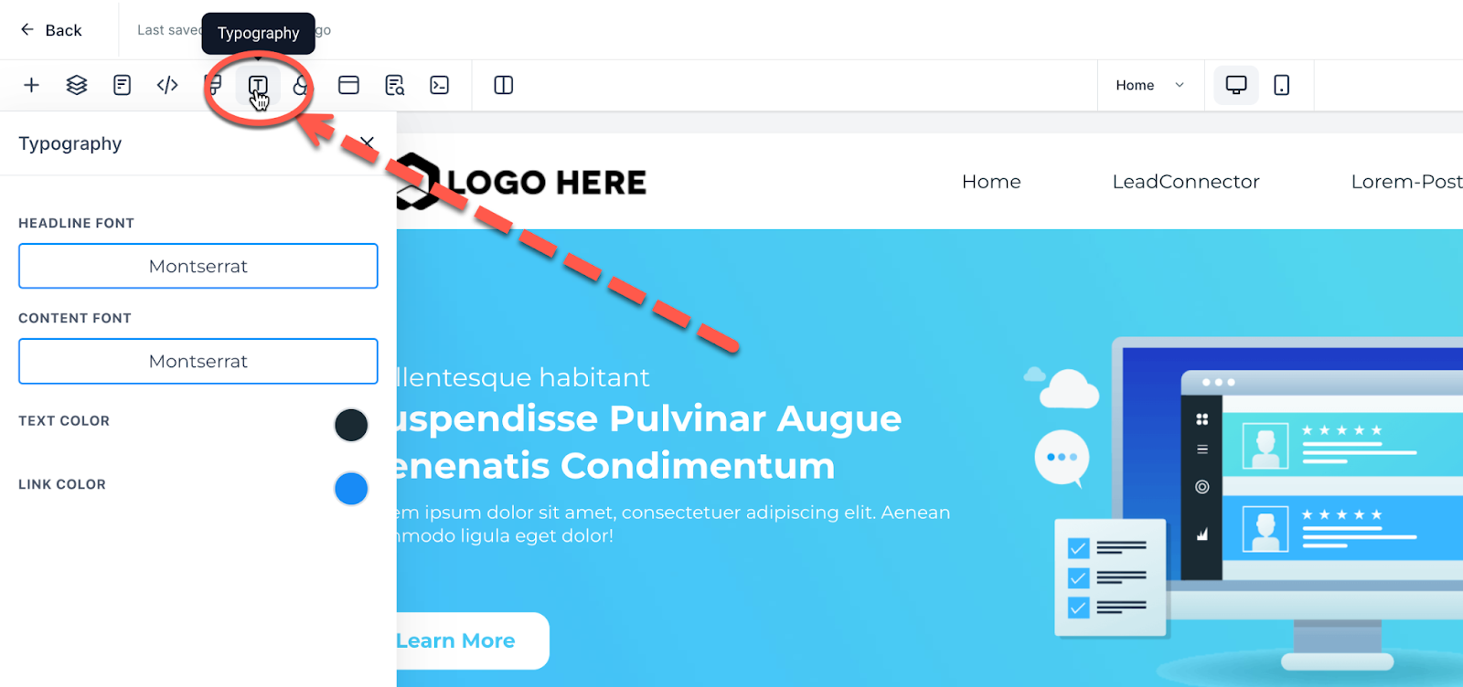
✍️ Typography
Adjust your default headlines, content font, text color, and link colors from the Typography tab.
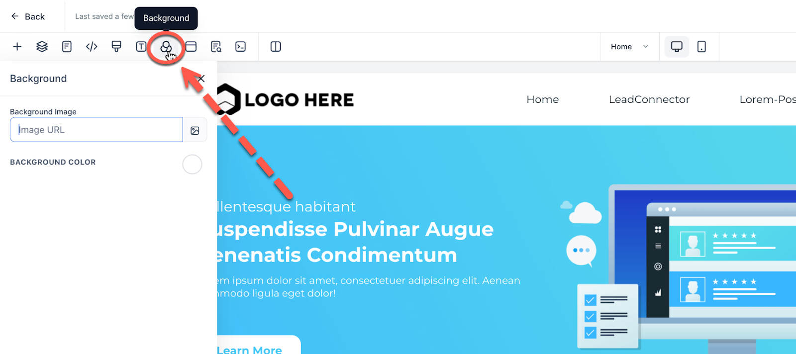
🖼️ Background
To change the default background image or background color, go to the Background tab. Note: Section-level settings override page background.
🎥 Want to set a video background for a section? Learn how here: Video Background
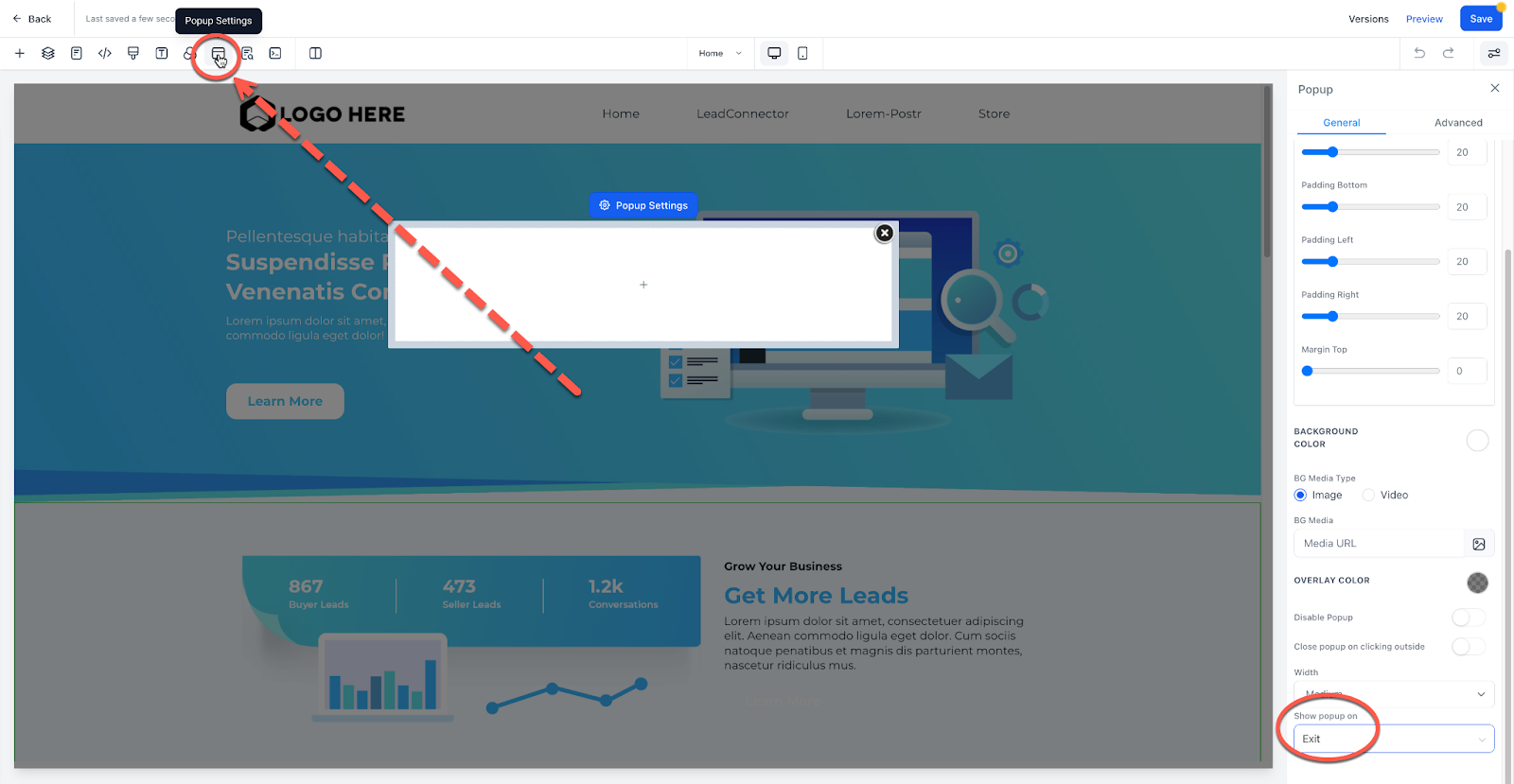
📢 Pop-Up Settings
Love them or hate them — pop-ups still convert.
- Add a pop-up from the Pop-Up Tab
- Use the pop-out menu to adjust properties
- Trigger it from a button, exit intent, or timer
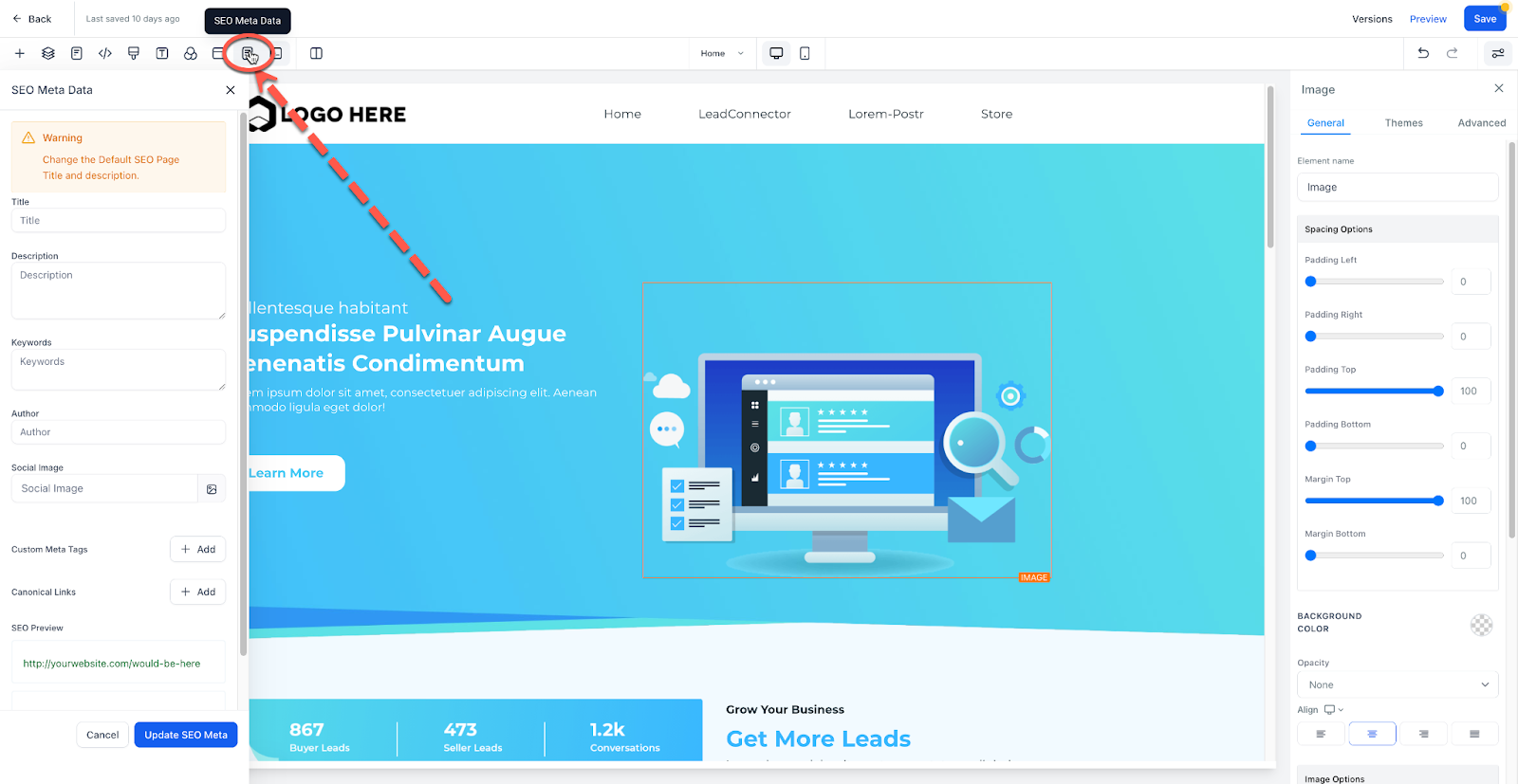
🔍 SEO Meta Data
Edit your SEO metadata to:
- Show titles in search engines
- Display link previews when shared
- Set proper tab names in browsers
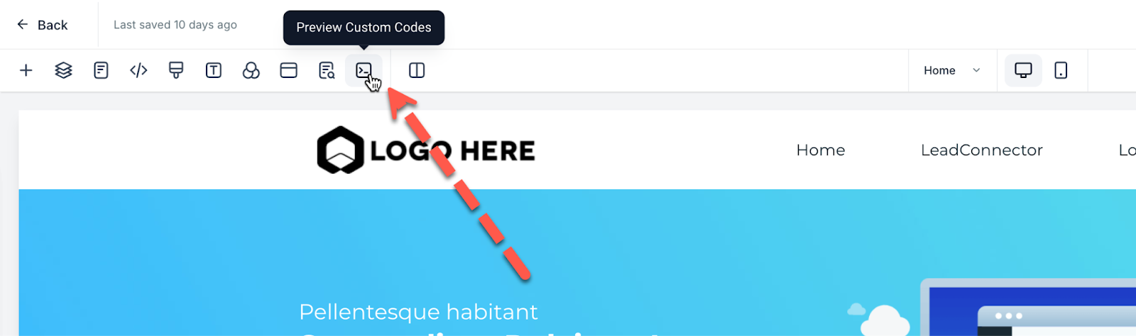
🧪 Preview Custom Code
If you've added custom code, this button loads it so you can preview it in the builder. If it doesn't work as expected, consult your developer.
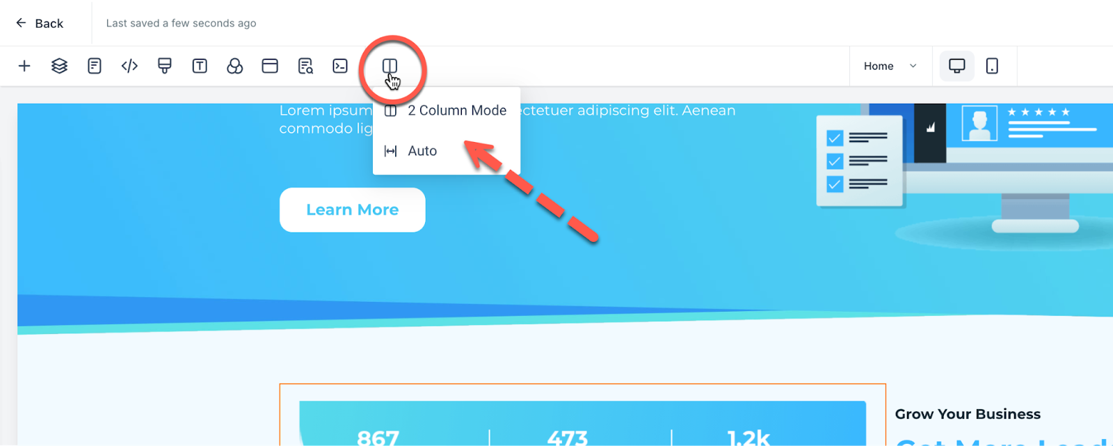
🖥️ 2 Column Mode vs Auto Mode
Choose between:
- Auto Mode: Setting panel overlays the page
- 2 Column Mode: Splits the screen into page (left) and settings (right)
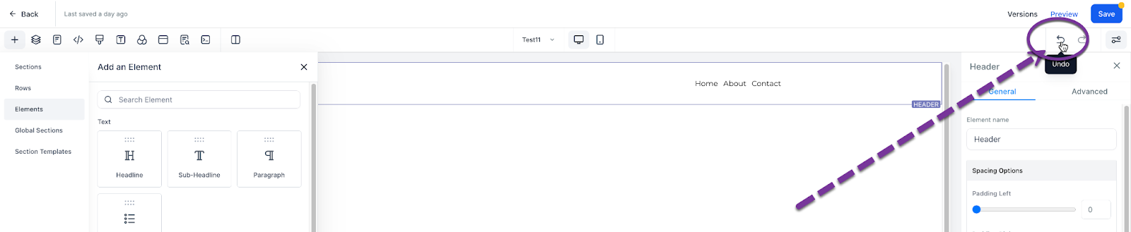
↩️ Undo / Redo
Use the Undo/Redo buttons in the top right to reverse or repeat changes.
⚠️ Only available during the current session. Reloading the page resets your session.
💾 Versions, Preview, Save, and Publish
Top right of the builder shows four key controls:
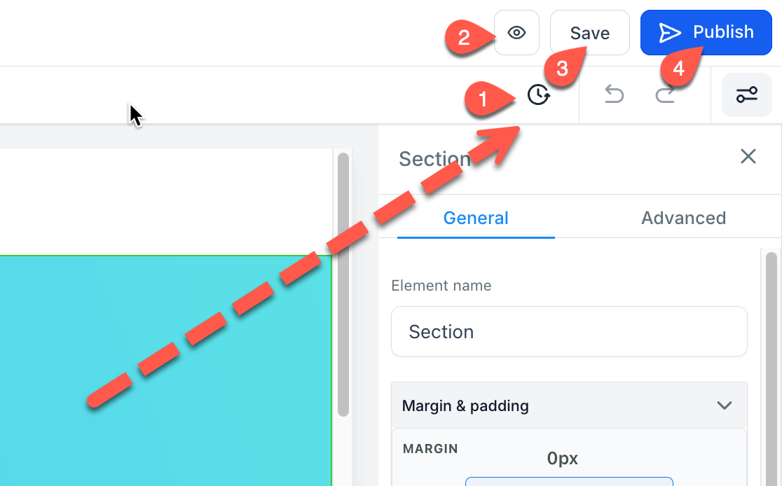 * Versions: Browse and revert saved versions
* Preview: See your site as visitors will
* Save: Save changes as a draft (not public yet)
* Publish: Make the current saved version live
* Versions: Browse and revert saved versions
* Preview: See your site as visitors will
* Save: Save changes as a draft (not public yet)
* Publish: Make the current saved version live
✅ Site Builder Tour Complete!
You're now familiar with all parts of the SalesMFast Site Builder.
Next: Learn how to edit the mobile view of your site.
📱 Editing the Mobile View of Your Site
Every site builder has both a mobile and desktop view. Unless you edit an object, the desktop and mobile views will be identical. When you go to review your mobile view of your site, you will likely find some aspects of your site you wish to change or adjust for your mobile viewers. This makes sense, mobile and desktop screens are different sizes. So we will need to adjust how the mobile view looks to best suit mobile viewers. Let’s learn how to edit your mobile view below.
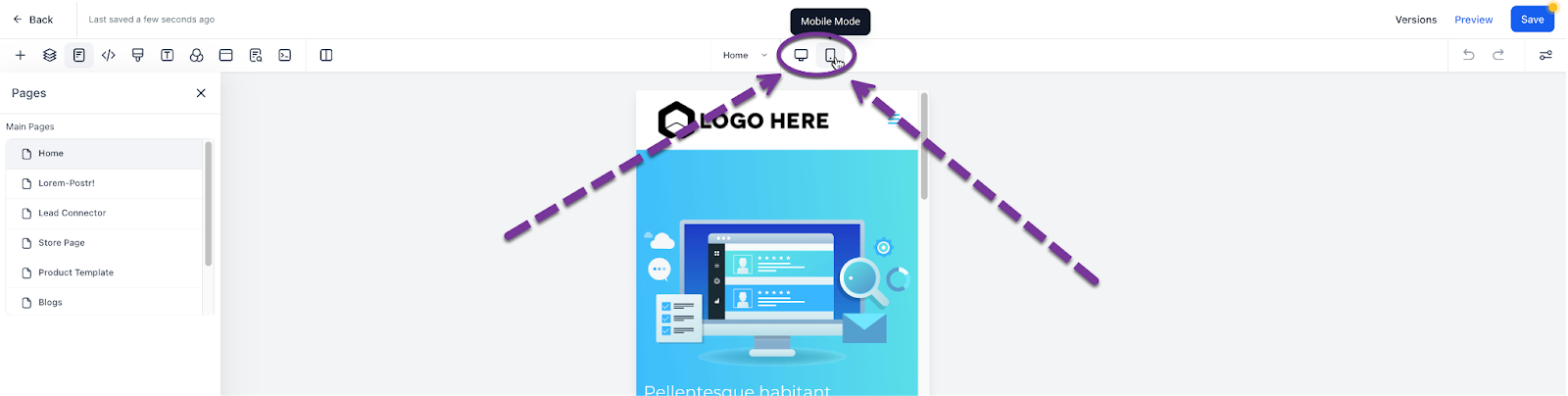
🔄 Mobile Mode
At the top of your editor, you will see a button for Desktop Mode and another called Mobile Mode. Selecting the “Mobile Mode” will toggle to the mobile view editor of your site.
 All Website objects by default are mobile and desktop visible. However, you can change this, which will help greatly in some circumstances.
👁️ Changing Object Visibility to Mobile/Desktop Only
More than likely, you will find you need to create a unique section, row, column, or element for mobile view only. You can edit the visibility of your elements with the visibility setting.
- Select any object
- Go to Settings > Advanced Settings
This is very helpful when optimizing the look and feel of your desktop or mobile views for your site.
 After toggling, you will only be able to see the elements based on how you toggle them. So if you removed Desktop, you would only see the element on the mobile editor view on the live mobile view of a website.
📐 Mobile Responsiveness Settings
Within your object settings, you will see mobile responsive toggles that allow you to edit an object's settings unique to mobile or desktop.
Example: Image alignment — you can set it for desktop, then toggle to mobile view and change how it looks on mobile.
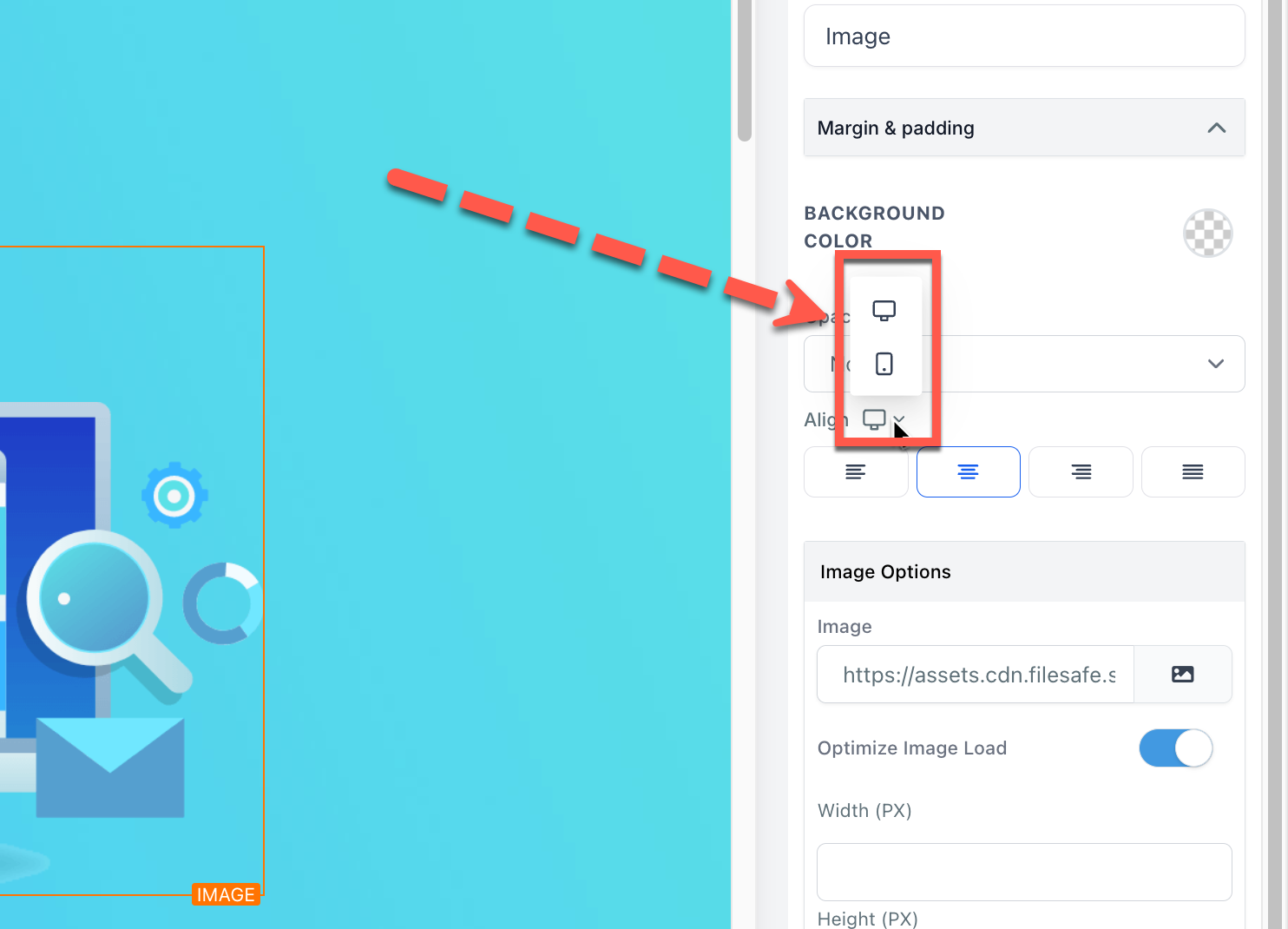 You will find mobile responsive settings like this on several object settings. SalesMFast is always working to add in more.
💡 Pro Tips for Mobile Mode Editing
There are a number of tips and tricks to learn when editing your mobile site, let’s check out a few:
✅ Finish Desktop Mode First
More often than not, completing a full version of your desktop view of your site makes it easier to edit your mobile view. So get that desktop view looking stellar then start working on your mobile view after your desktop view is the way you like it.
🧭 Mobile Navigation Menus
If you have a site navigation menu:
- Create a Global Section with Mobile-only visibility
- Add it to the mobile version of each of your pages
- Do the same for Desktop Navigation menus with desktop-only visibility
📄 Duplicate an Object and Change Visibility
If you cannot get a section or object to look good on mobile without editing the desktop view:
- Use the duplicate function
- Set one to Desktop only, and the duplicate to Mobile only
- Customize the mobile one without affecting the desktop
This is especially great for images.
🖥️ Learn how to see the Mobile View of your Site on Your Desktop
Did you know… you can see the mobile view of your site from your computer? Learn how here.
🎉 Mobile View Complete!
Now that we have a kill desktop and mobile view of our site, it’s time to finalize some backend settings as we go LIVE!